The Vision
As a visual storyteller, the way my brand presents itself should carry the exact same feeling as the work delivered to clients: warm, grounded, timeless, and intentional.
Over the past few years, Gavin Zahner Photography has grown into a focused space for natural light portraiture, senior stories, and authentic moments. To match where the business stands today and where it is heading, I developed a refreshed visual identity—bringing together a refined typographic system, an organic color palette, and a cleaner mark that speaks to craft and narrative.
The Identity Breakdown
Typography: Editorial Sophistication Meets Clarity
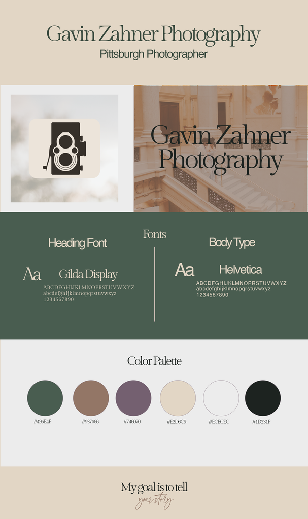
Heading Font – Gilda Display: A classic serif with delicate proportions and high-contrast stroke weight. It introduces an editorial, timeless warmth suited for headlines, invitations, and gallery title cards.
Body Type – Helvetica: Modern, legible, and unpretentious. Pairing a neutral grotesque sans-serif with an expressive editorial serif ensures smooth readability across contracts, client guides, and digital screens.
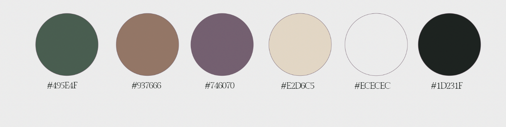
Color Palette: Grounded & Organic
The color story draws directly from natural light, earth tones, and warm golden-hour tones, designed to sit naturally beside portrait photography without competing with it.
Tagline: Putting Words to Action
The visual mark combines vintage camera geometry with minimal silhouette design—a homage to classic manual cameras and the craft of capturing fleeting moments. Beneath it all sits the core guiding every session:
My goal is to tell your story
Looking Ahead
This brand update isn’t just about fresh colors or fonts; it sets the standard for how clients experience the process from the very first inquiry to final gallery delivery. You will see these elements reflected across the portfolio, client guides, and session workflows
Style Guide
Attached below is my style guide.
Leave a Reply